Obscura

    How refreshing it is to learn you know almost nothing!  I most recently had this sensation at a small restaurant where the wine list was devoid of my preferred Burgundies and bubblies.  What blinked back at me was, if not entirely foreign, unfamiliar enough that my finger reflexively ran itself beneath the names as I sounded them out.  Mos-chi-fil-ero, my lips forming the syllables while the patient waiter hovered with his pencil.  Ne-rell-o Mas-ca-les-e. Sure—a bottle of that one, please.  It was terrific: a Sicilian varietal high in acid, low in tannin, but with a layered wildness that might, in more familiar wines, have been considered a flaw.  This is precisely the problem with becoming too familiar with anything; at some stage the enjoyment is supplanted by a persistent desire to find fault.  The unfamiliar, however, can act as a tonic, rejiggering expectations.

    The bonus to lesser-known wines are the terrific names.  We have all likely heard of Gewürztraminer, which makes highly aromatic white wines in Alsace and Germany, but what about Grüner Veltliner, (Austrian) Chasselas (Swiss), Grk (Croatian), Xinomavro (Greek), or, my personal favorite, Zweigelt.  This Austrian grape is the product of hybridizing two other fairly obscure varietals (St. Laurant and Blaufränkisch) in 1922.  Zweigelt makes wines of extraordinary finesse, at once balanced and firm while still managing a wily character.  Smoked brisket on Royal Derby china, if you will.  Incidentally, the name, pronounced TSVY-gelt, is taken from the brainy fellow who created it, which wasn’t his choice.  Dr. Zweigelt wanted to name his new grape rotburger.  

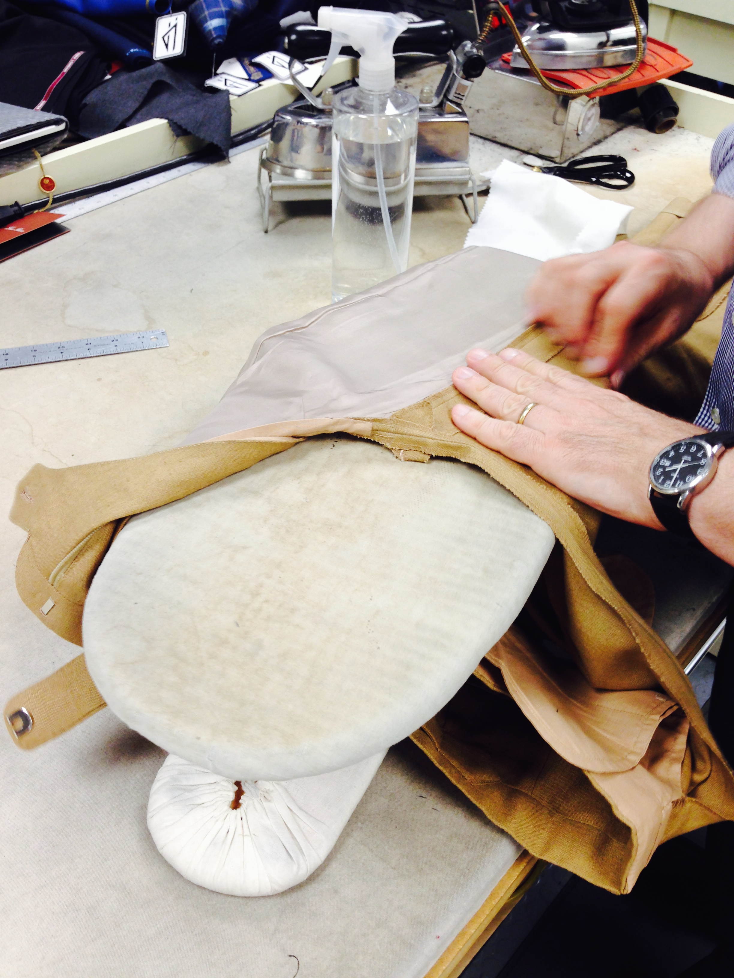
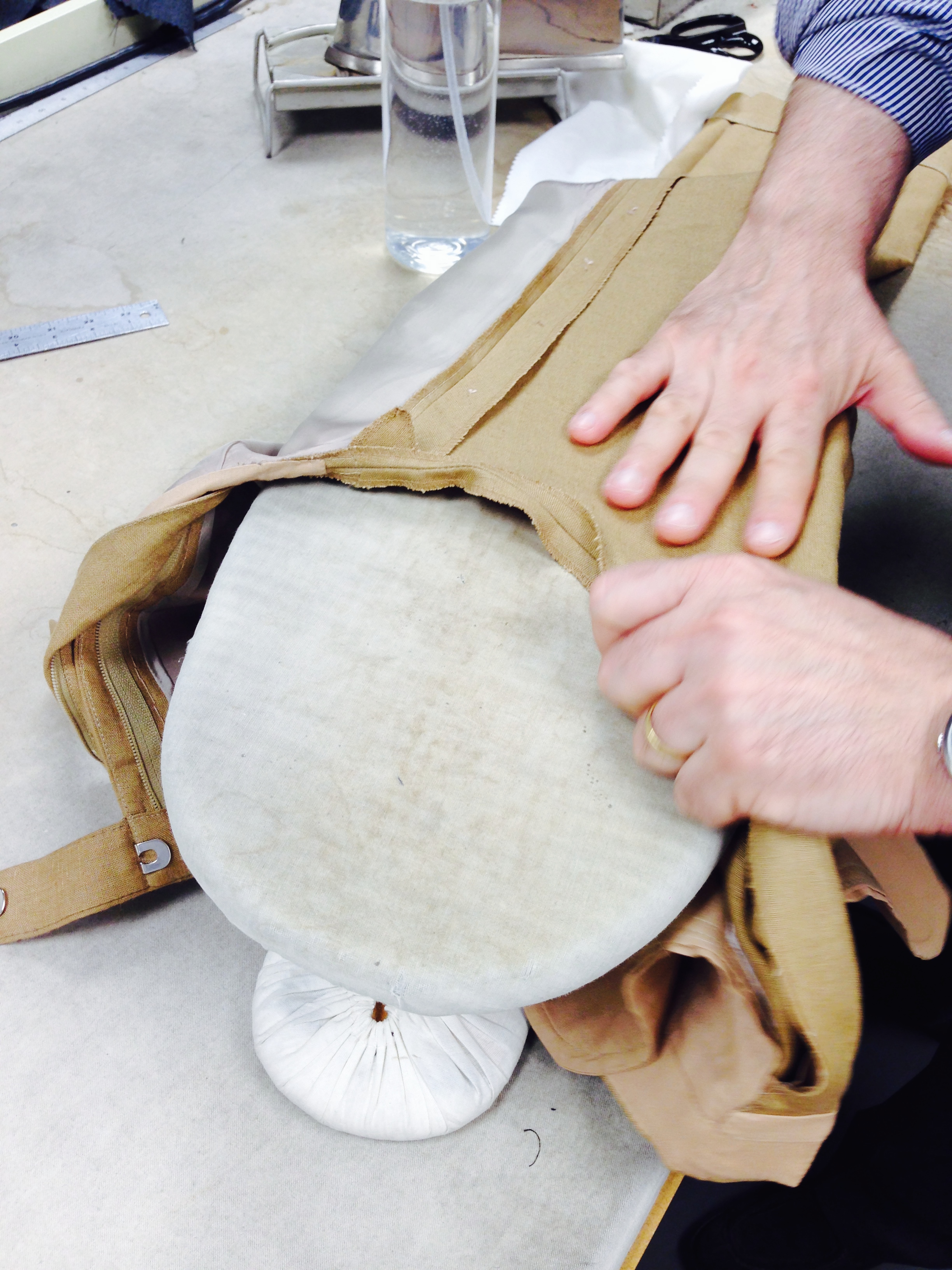
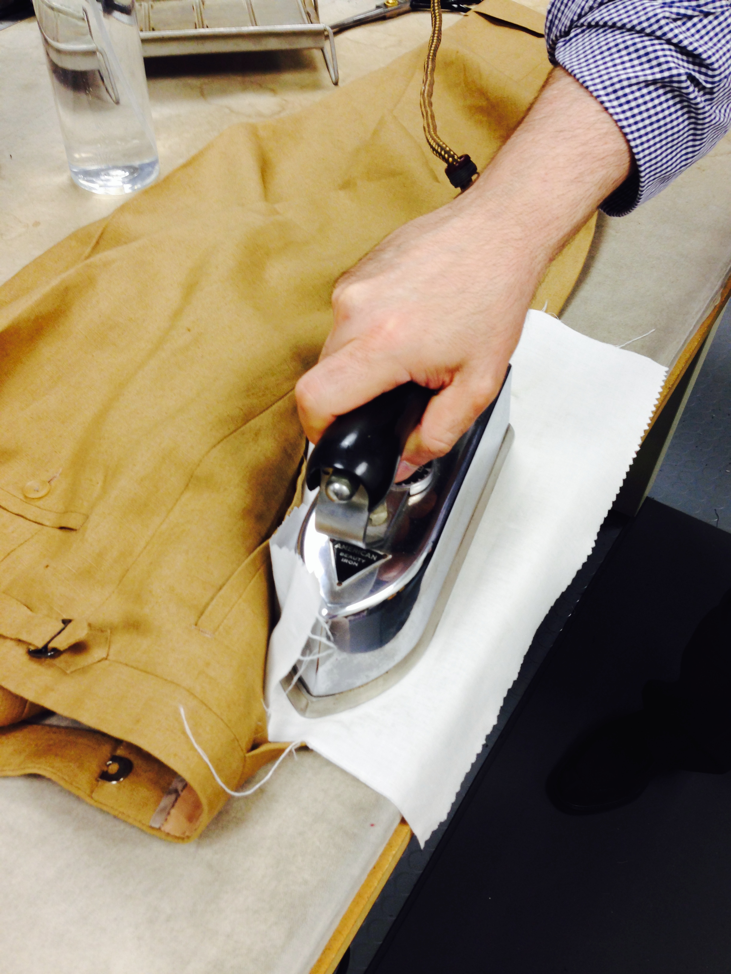
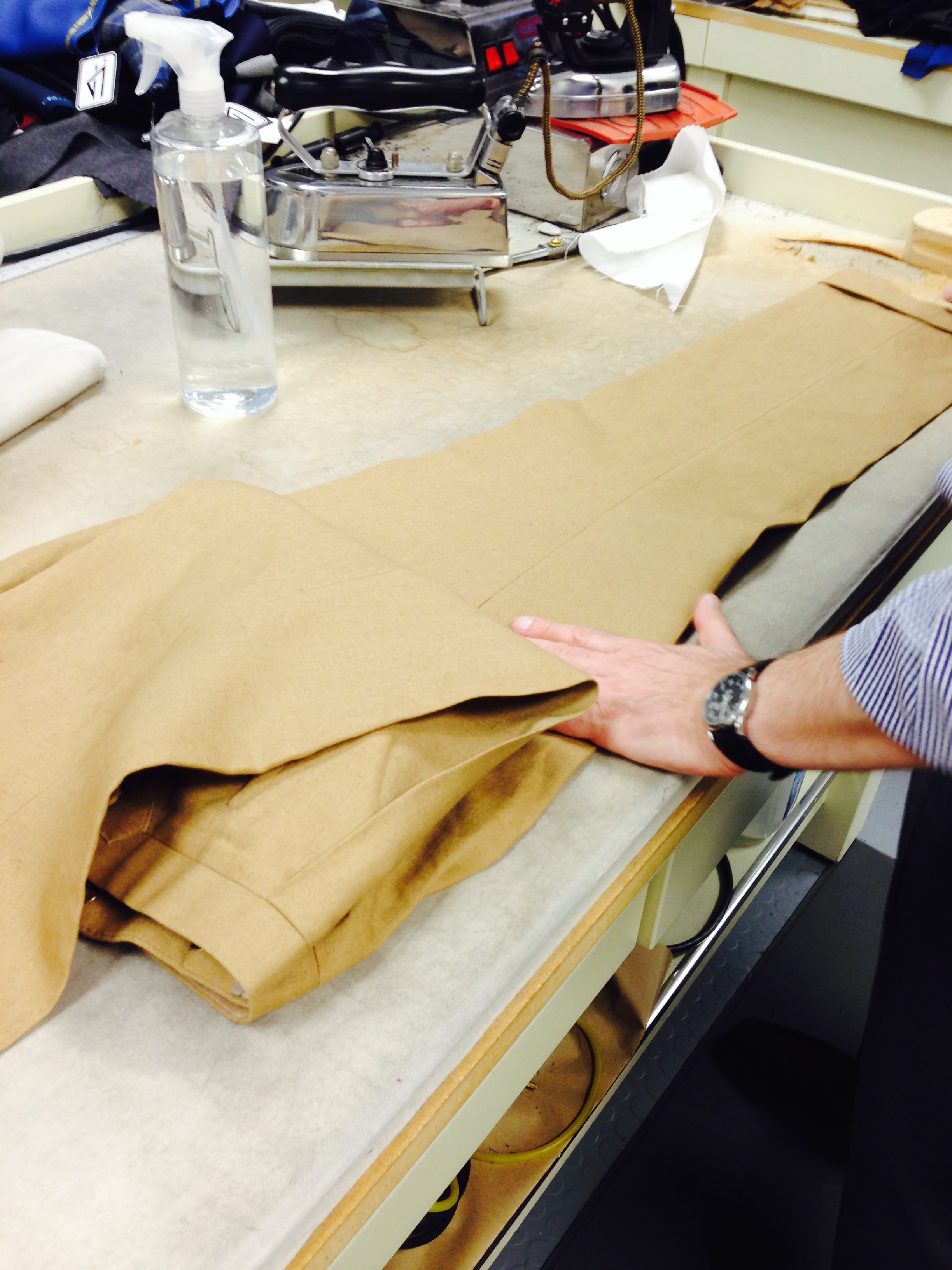
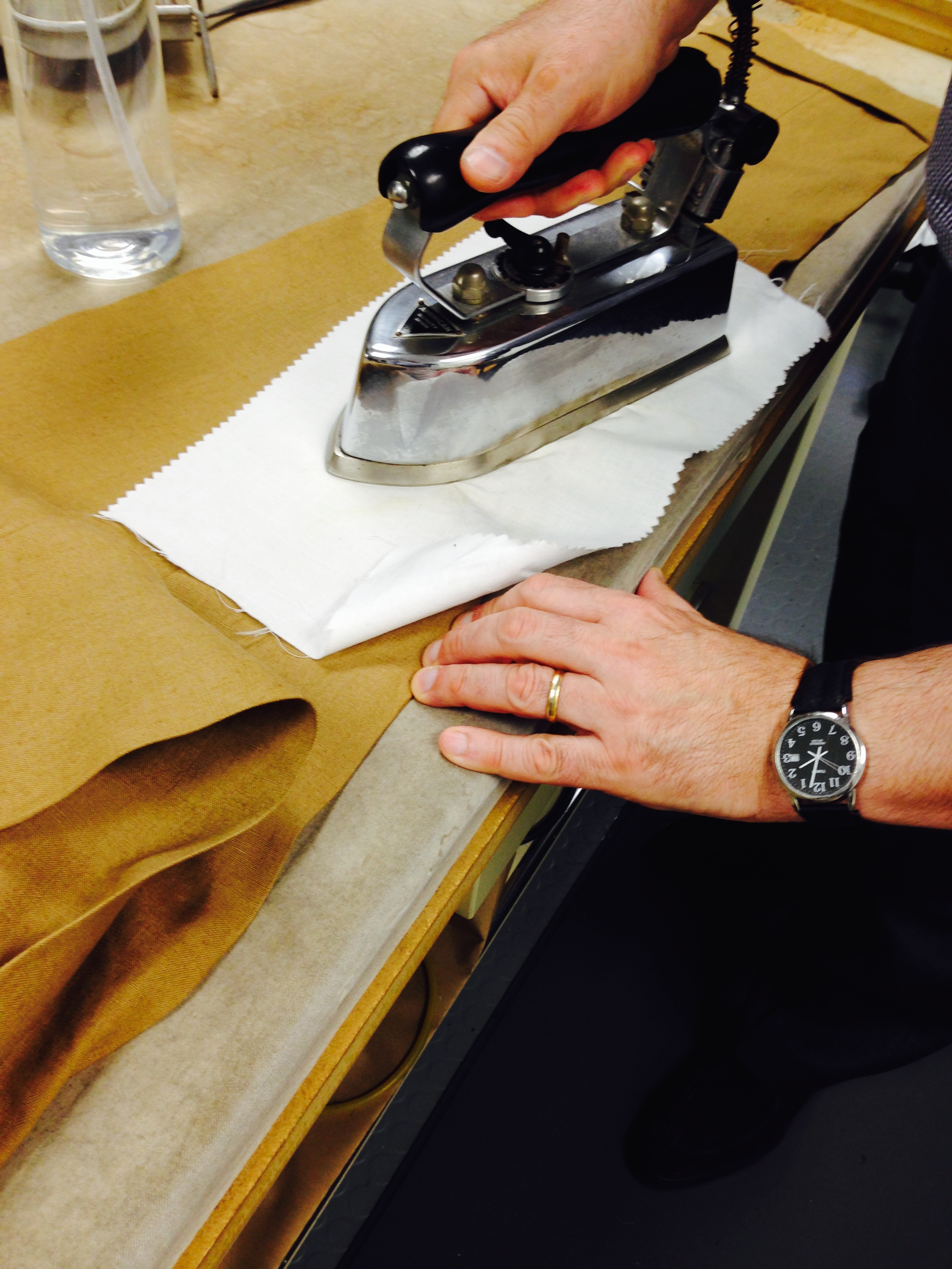
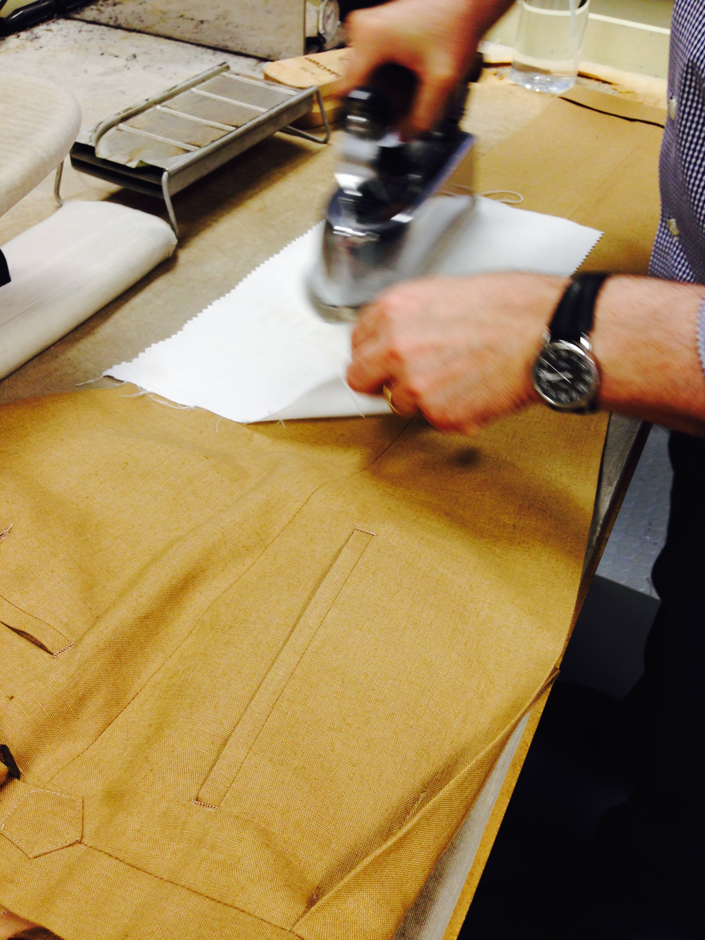
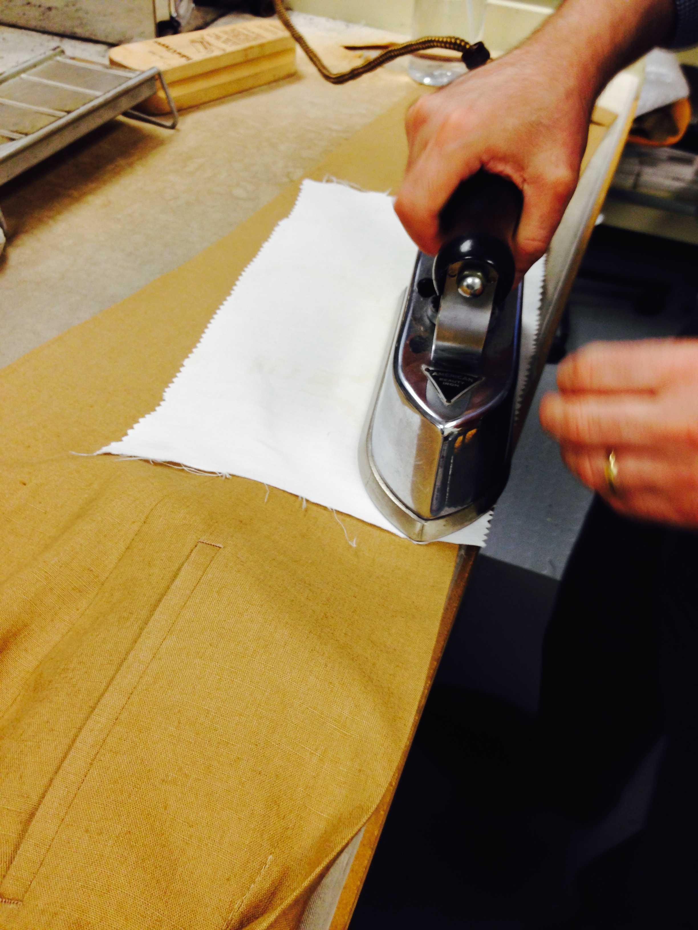
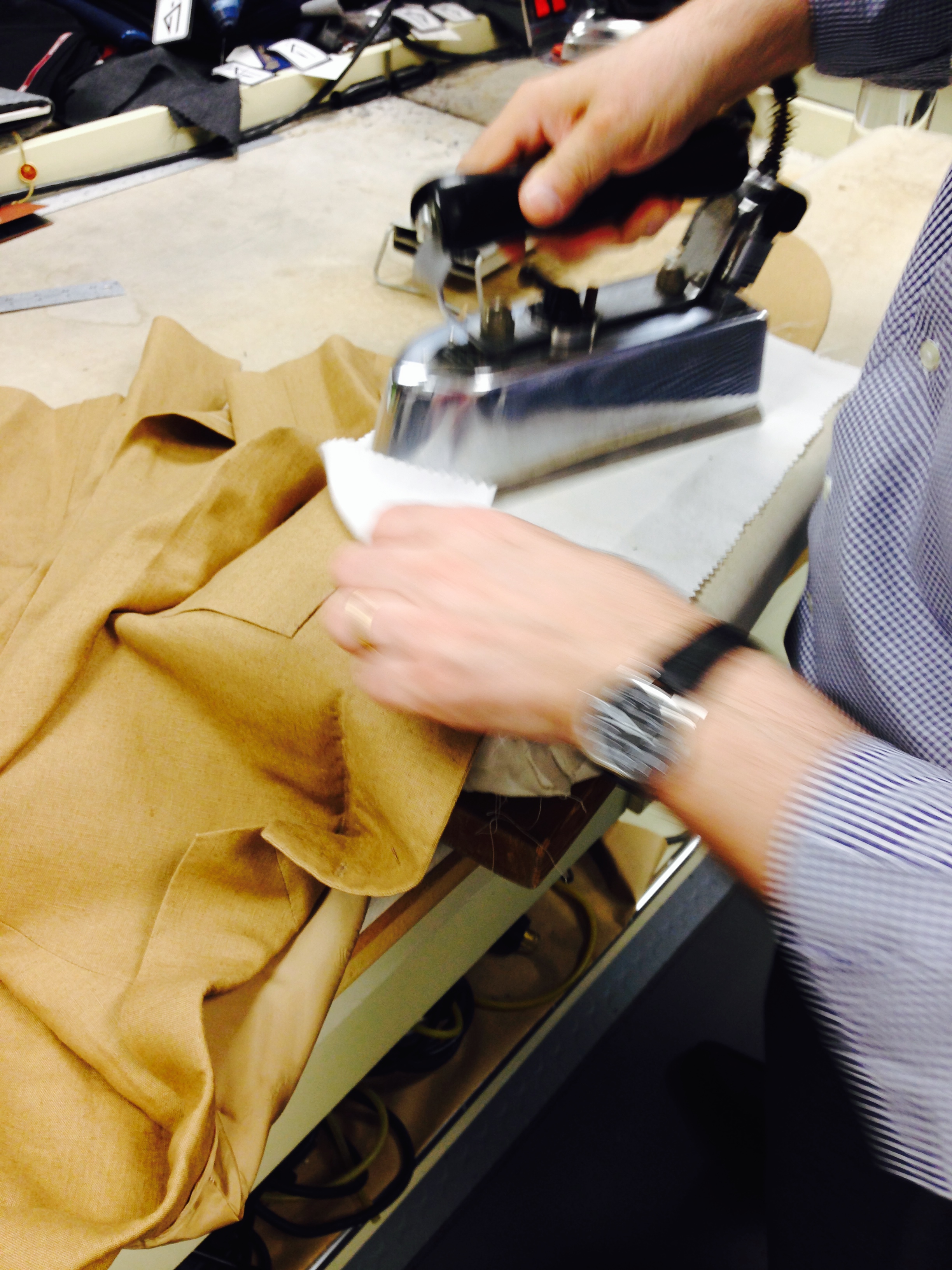
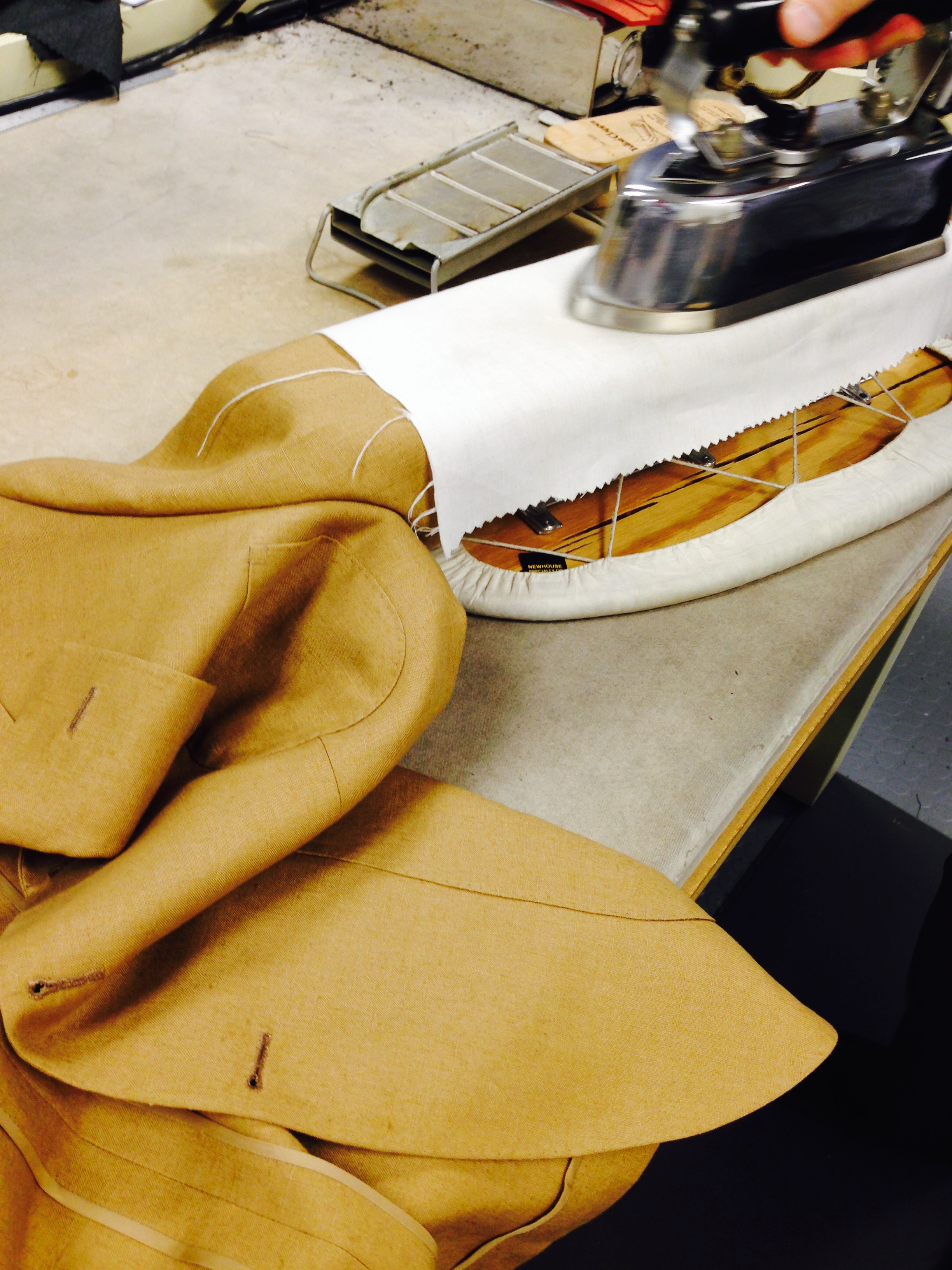
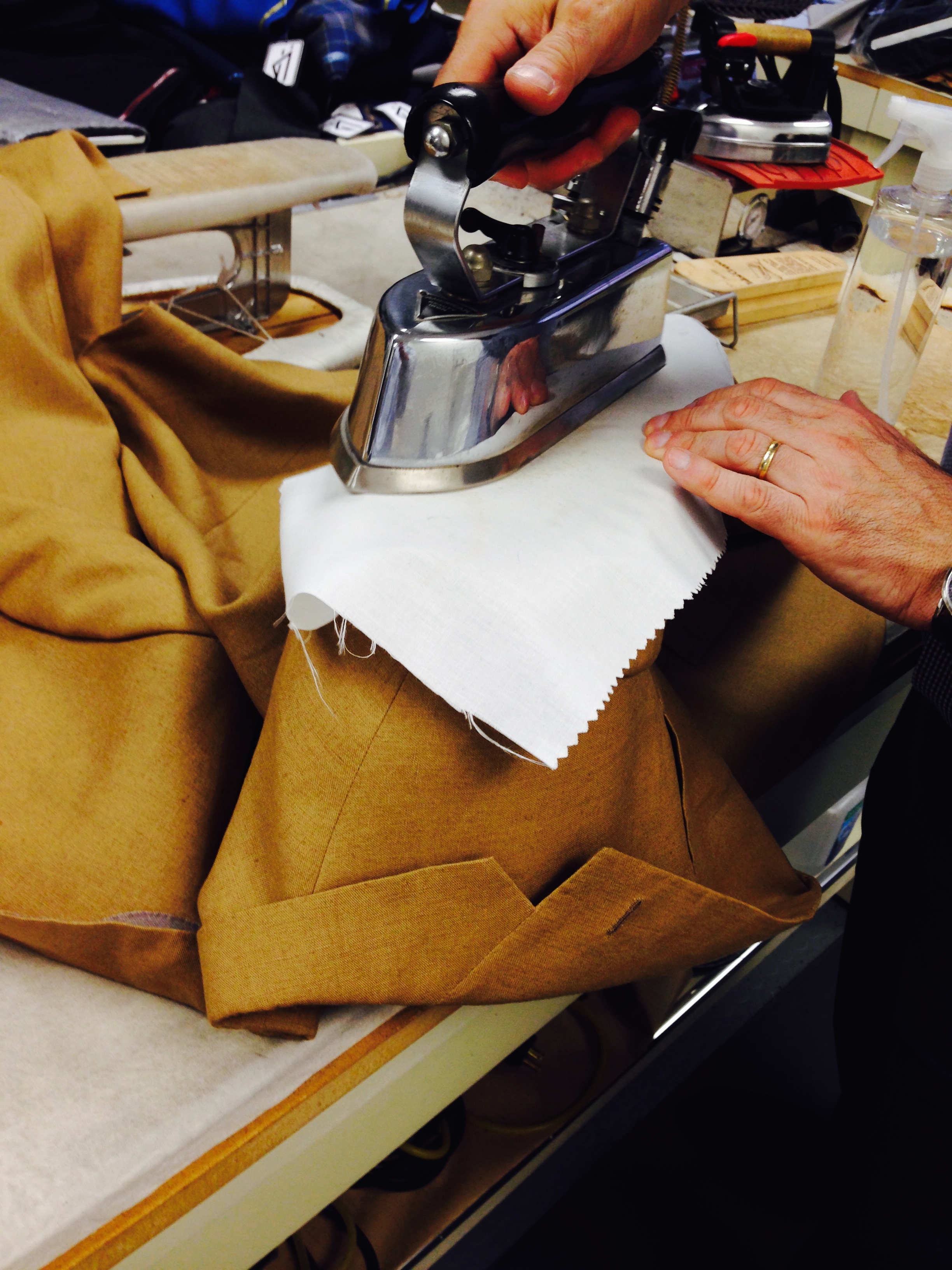
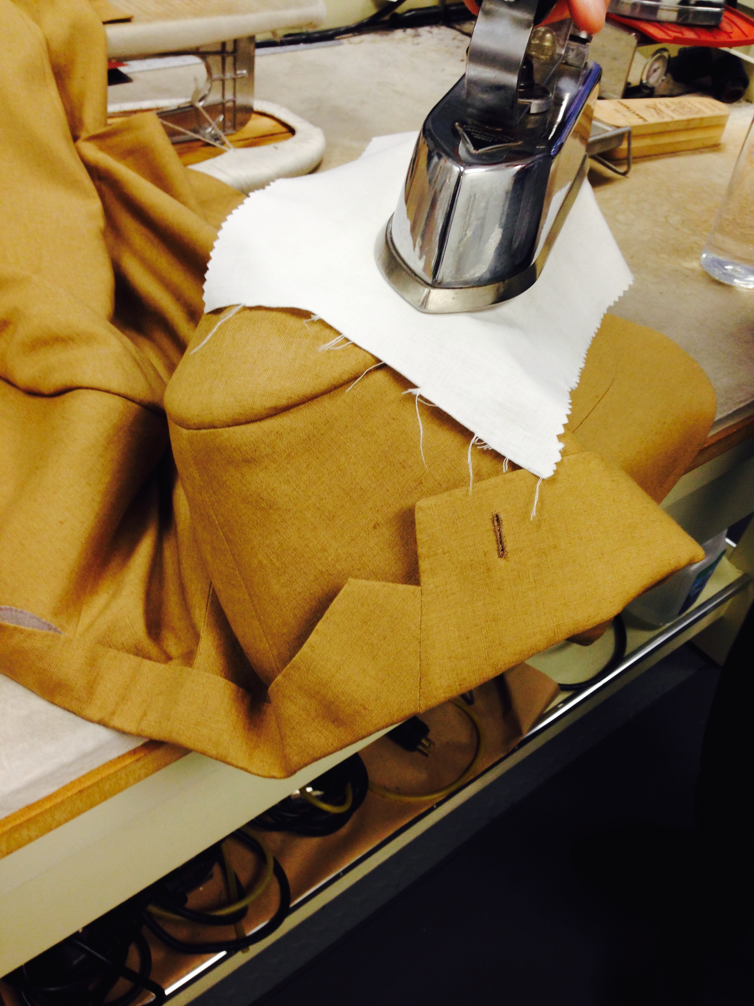
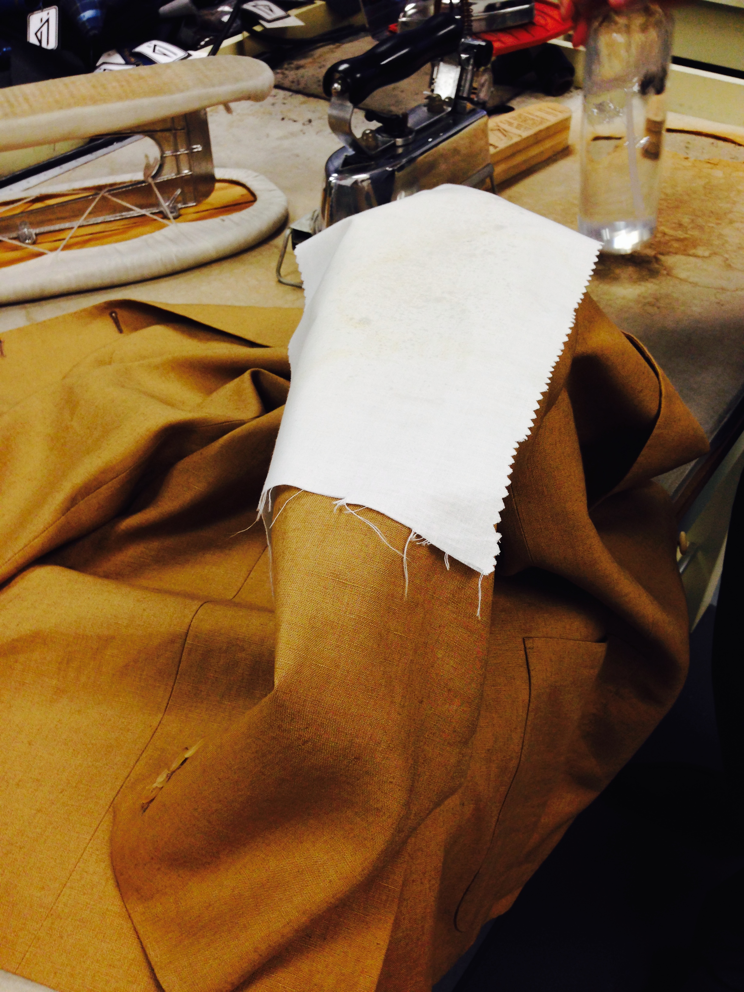
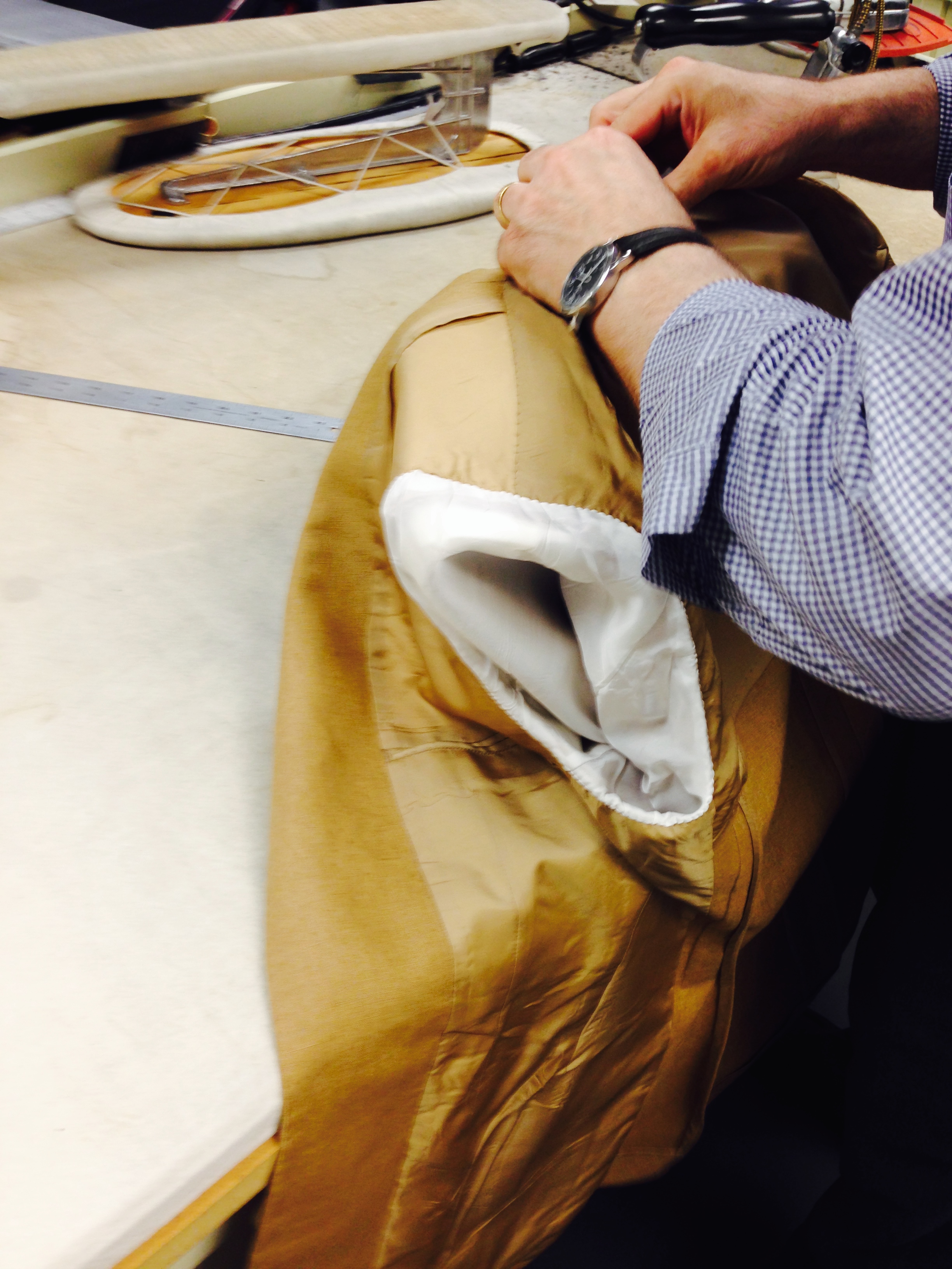
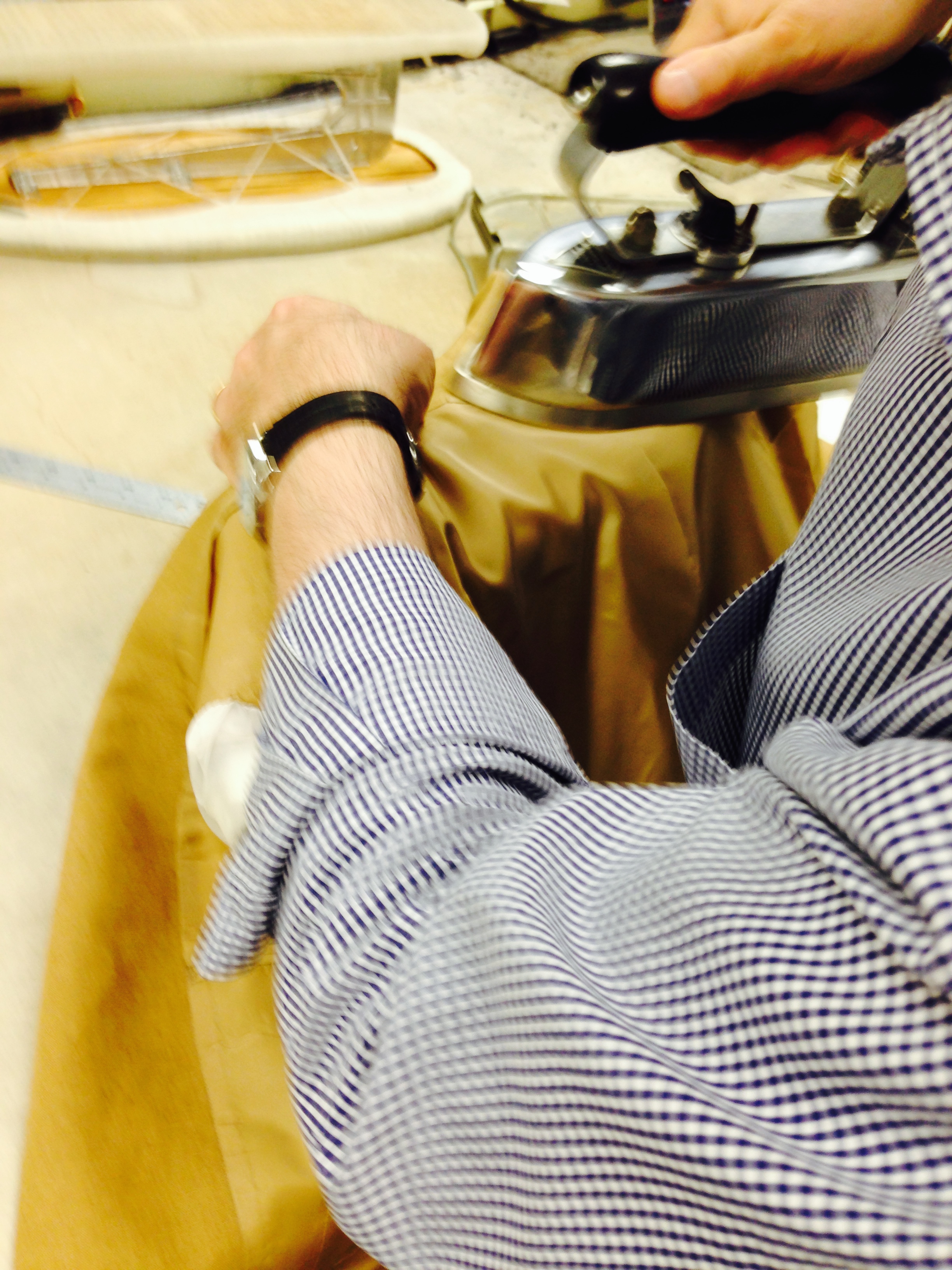
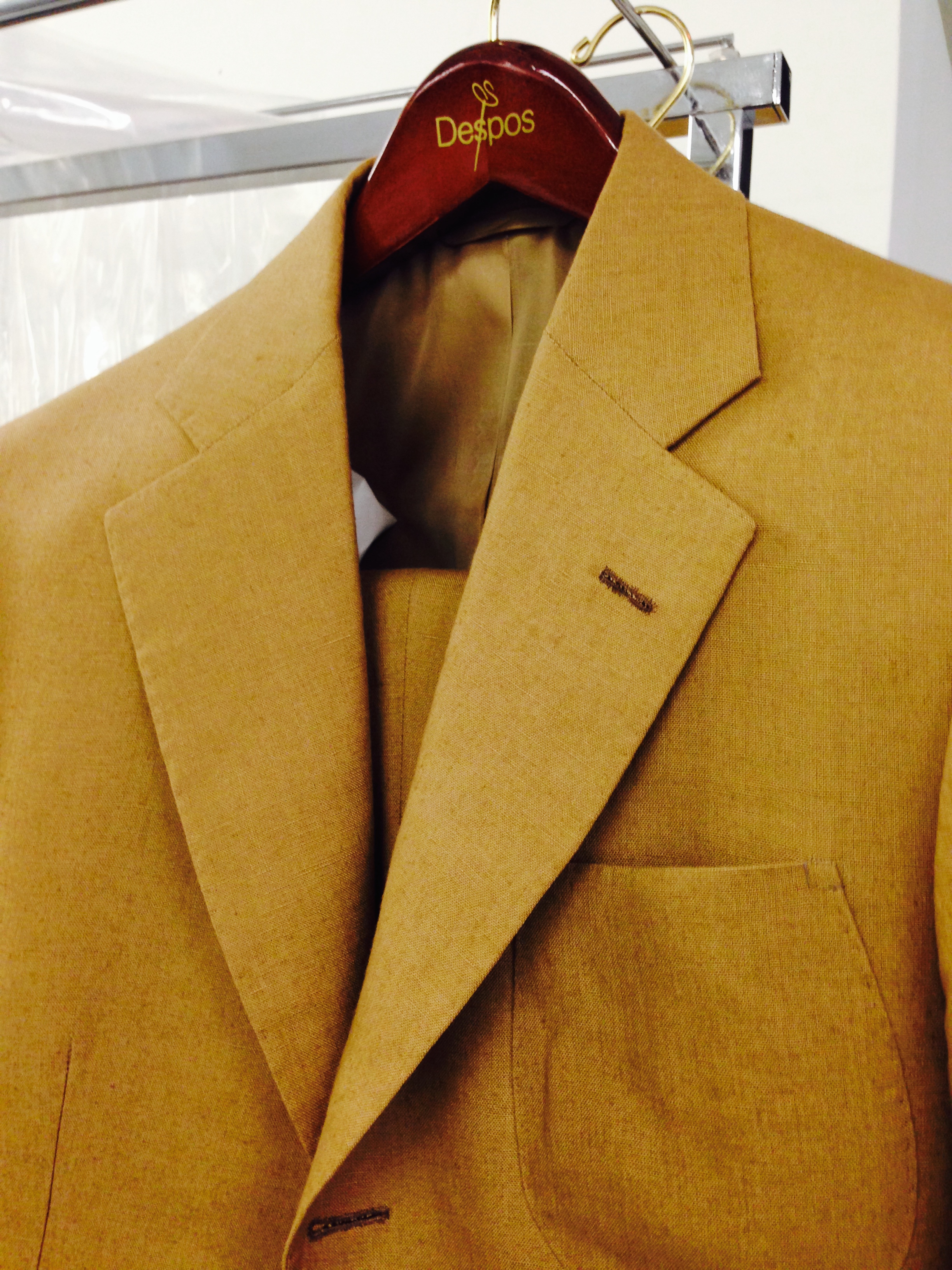
    Strangely, a similarly jarring sensation emerges when confronted with an obscure clothing material.  Cloth enthusiasts know this well.  I have often been lulled into thinking I understand cloth, at least from a consumer’s perspective, simply because I recognize the great divide between smooth worsteds and fuzzy woolens and have a working knowledge of twill versus plain weave.  And then I behold some rare specimen—perhaps a sixteen ounce high-twist hopsack or ethereal jacketing that, impossibly, still has nap—which unhinges entirely whatever junior-league expertise I thought I had.  Tweed can be especially enlightening: I like fourteen ounce cheviot for general wear, but interest in heavier tweeds has recently exposed me to keeper’s tweed almost twice that weight.  And what about the luxury sector; cashmere is old-hat compared to vicuña, yak and cervelt (cloth woven from the downy undercoats of New Zealand Red Deer).

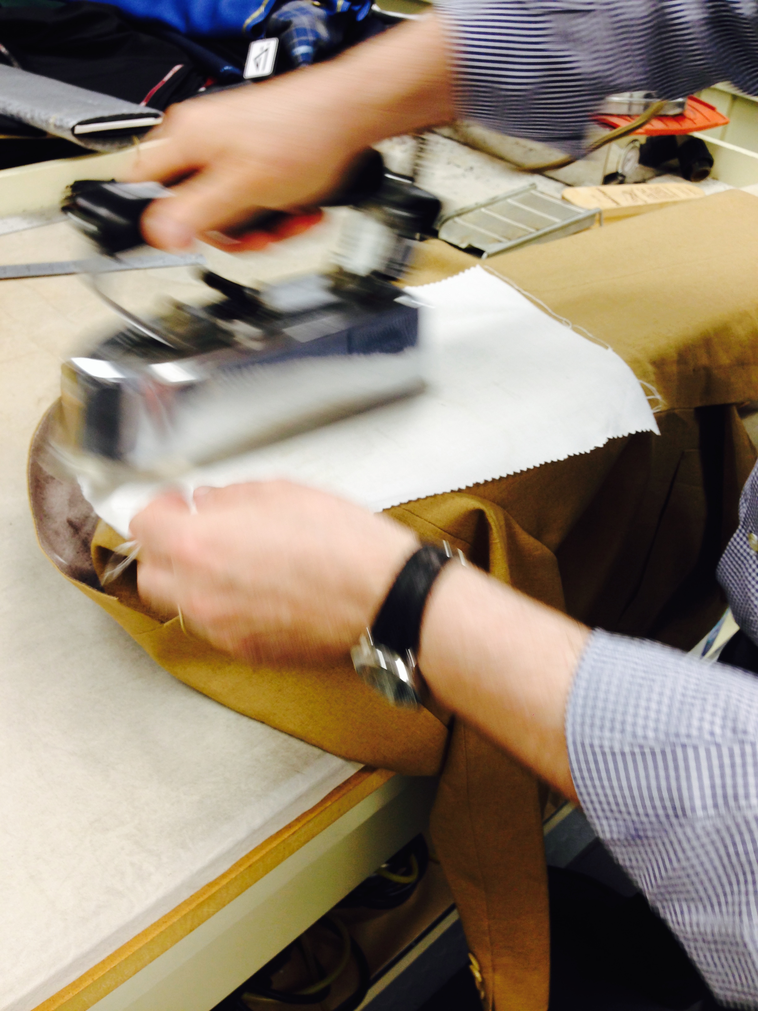
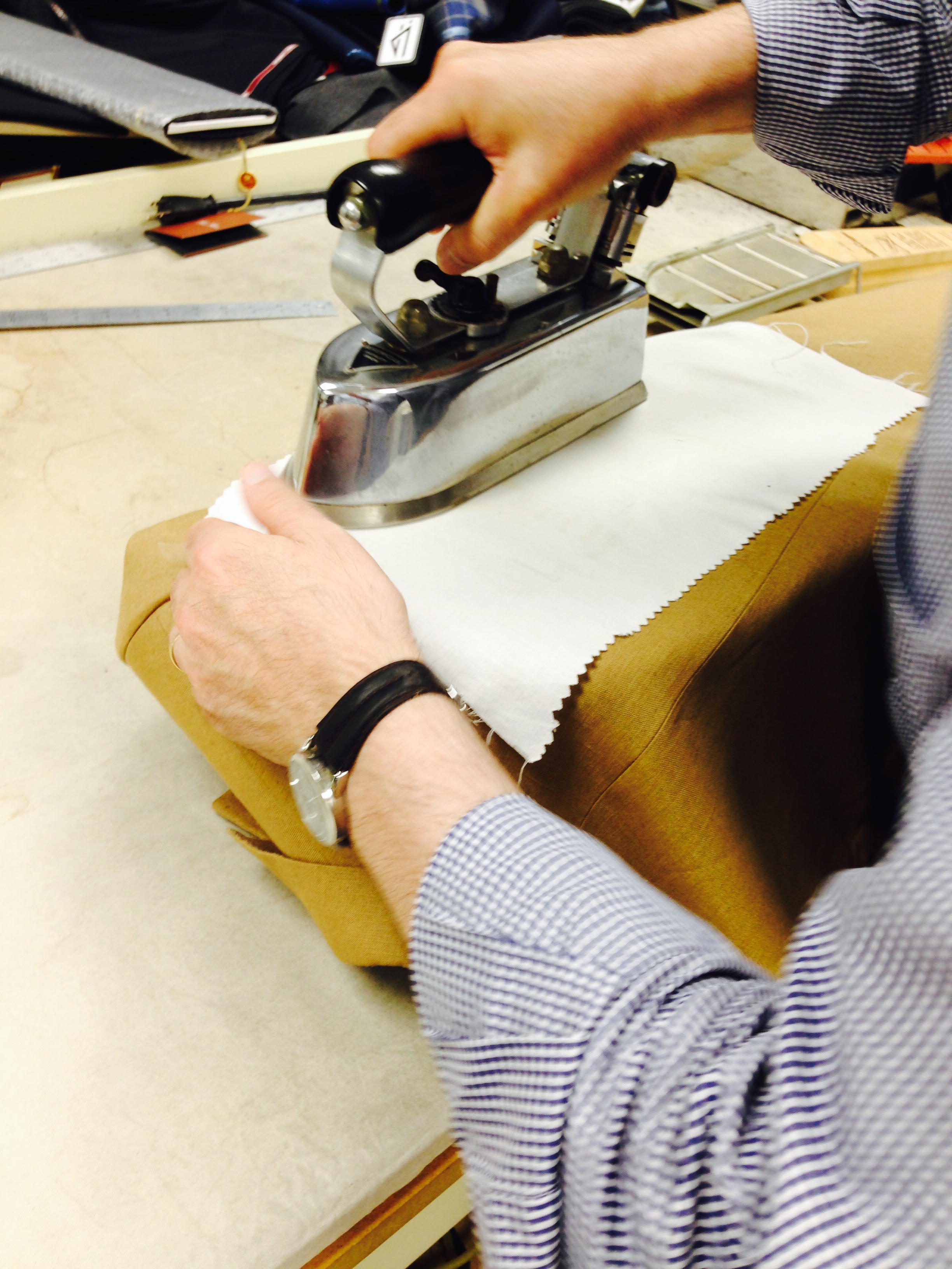
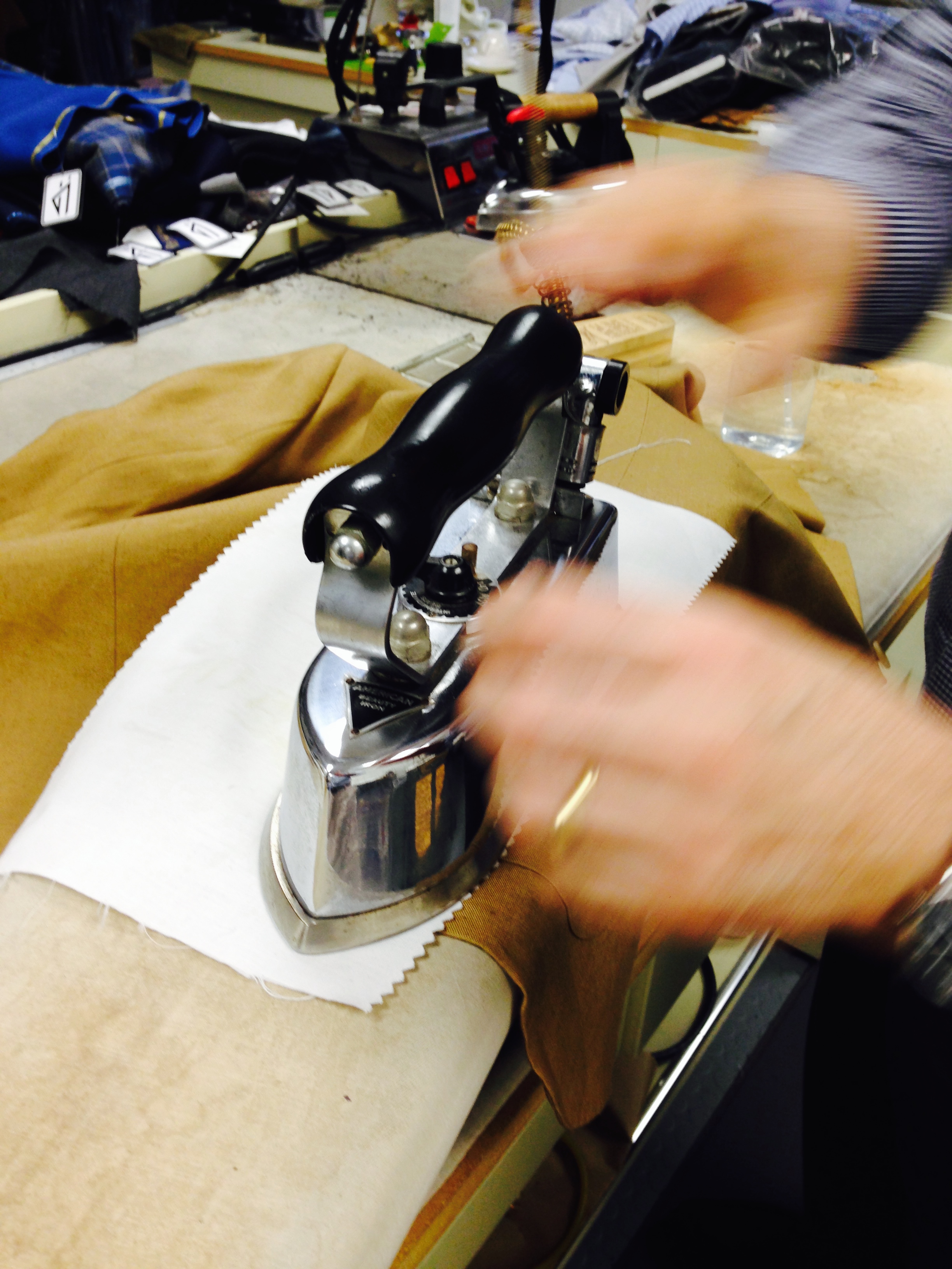
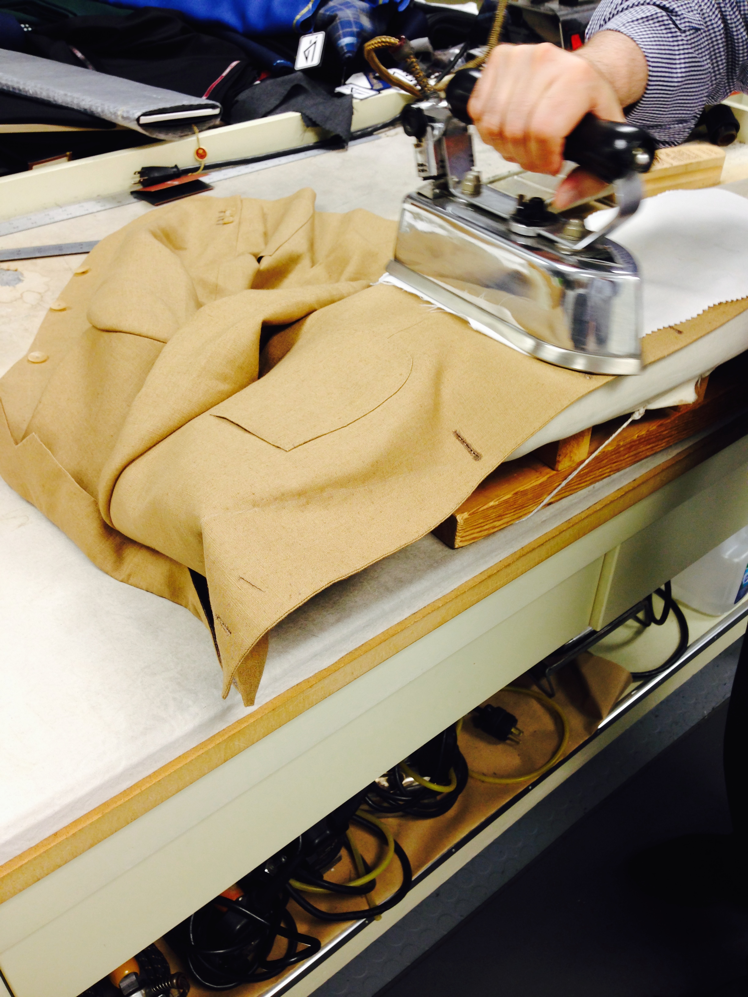
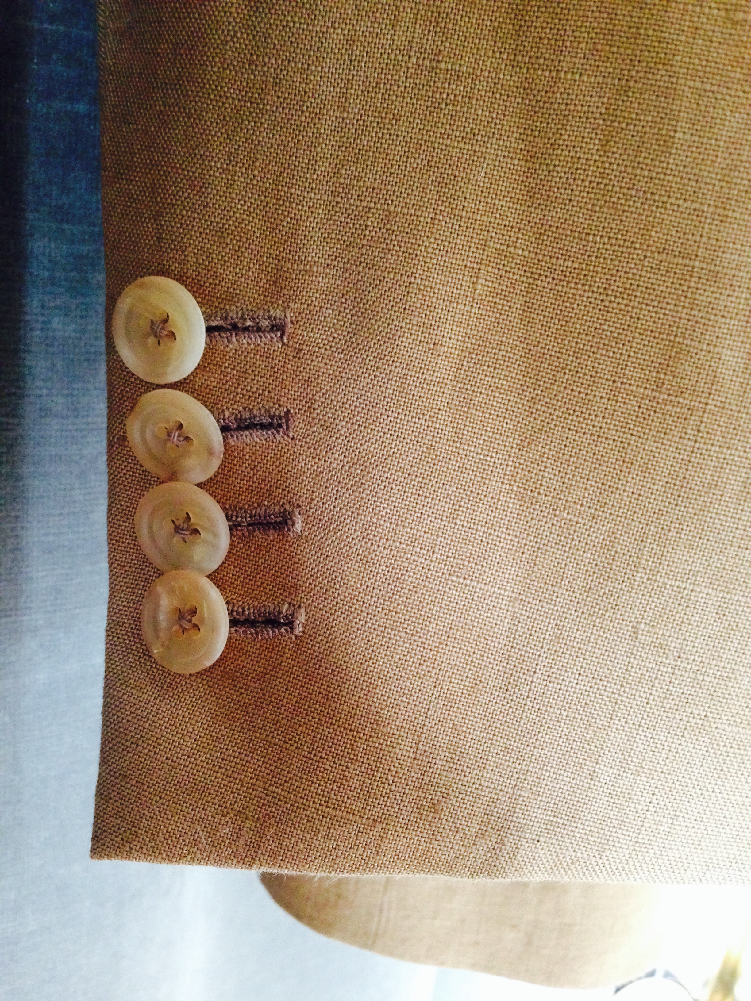
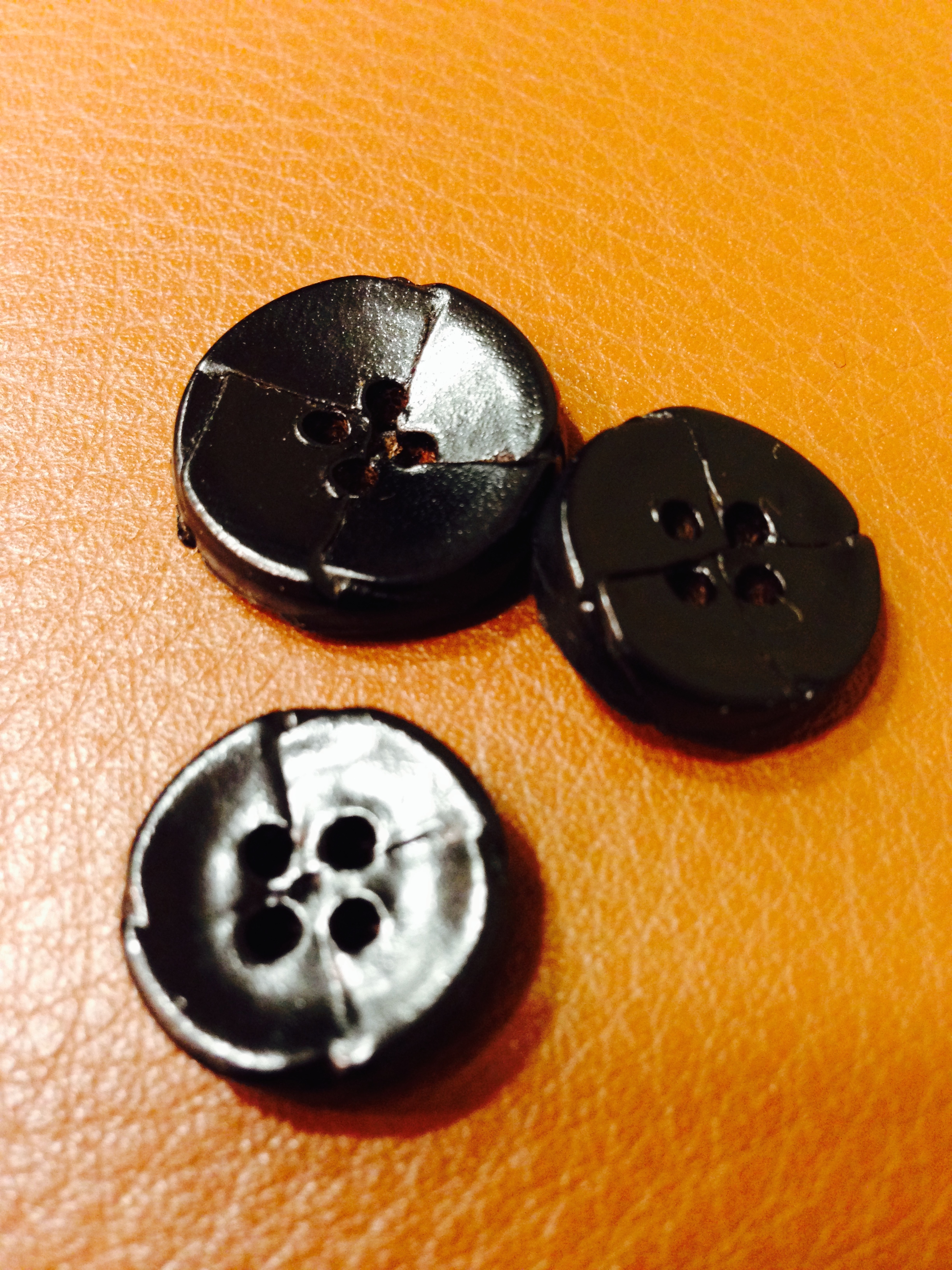
    Neither is the seemingly pedestrian button immune from delivering a humbling blow.  With the exception of a set of antiqued silver ones sewn on a blazer, my buttons are horn.  I always assumed these handsome articles were the last word in fastening elegance.  But all it takes is a curious perusal through a tailor’s back room, as I recently did with Chris Despos.  There I spied buttons of corozo nut, coconut shell, and mother-of-pearl—both natural and smoked—any of which would be ideal for a summer-weight navy jacket.  The most shocking of all, however, were leather buttons.  Despos’ were far from the chunky leather-wrapped domes intended to complement rustic outerwear of heavy tweed though.  Instead, these are slim four-hole buttons that, upon closer inspection, are clad in neatly pressed layers of leather.  The effect is simultaneously refined and untamed.

    But are rare cloths and difficult-to-pronounce varietals important beyond their novelty?  Does the  jacket with understated leather buttons and a glass of Zweigelt share more than a certain insider appeal?  I suggested earlier that the unusual and rare can have the tonic effect of resetting the senses, but I wonder if a deeper agency is at work.  For every appealing new wine, for every interesting fiber or button, a dozen others fall short of expectations, and even those that do appeal can have limited shelf-life.  In this sense, indulging the obscure is sometimes refreshing, but far more often, merely confirmation of a preference.

The Problem with Consistency

    Of the well-thumbed photographs that appeal to those interested in men’s clothing, there is one floating around the internet that has always confounded me.  It is a wide-angled shot of what I assume was only a fraction of the Duke of Windsor’s wardrobe.  From left to right sweeps perhaps two dozen tweed, corduroy and tartan jackets.  The scale of patterns, the variety of buttons, the unusual cuff treatments—a veritable encyclopedia of menswear esoterica is fully on display.  I wish I could enjoy the details too, but I just can’t get my mind around the other glaring aspect of the photo: no two garments seem the same size.  

    I say seem because these things can be awfully difficult to determine with any certainty.  There are coat hangers to consider; some stems are visibly longer and others rather stubby.  The angle of the shot might exaggerate things.  Then again, some sleeves differ as much as six inches, and the skirt lengths vary as well, but not proportionally, and some jackets are just  short generally while others could be said to be longish.  The Duke’s closet reminds me of a clearance rack of multi-sized jackets at a thrift store.  A very stylish thrift store, mind you.  

    I often mull consistency.  Today’s computer-aided design (CAD) machines precisely cut carefully established patterns for the assembly of ready-to-wear men’s suits.  The tolerances for error are minute, and any pieces with variance greater than some pre-determined and low threshold are marked for the scrap heap.  Good ready-to-wear suits all in the same size should, by every metric, be identical.  That’s just not my experience though.  I was quite happy in a well respected ready-to-wear brand for several years.  And while most of it fit as well as it could, one in four pieces had some weird inconsistency—a fuller sleeve, some slightly narrower lapel.  Like any self-respecting clothing enthusiast, I took a tape-measure to the garments to confirm my anxieties.  Laugh all you will; it was later admitted in strict confidence to me by one of the senior sales associates that the plant manufacturing their garments was having serious consistency problems.

    The other aspect of the issue is that I wasn’t precision cut by a CAD machine.  Realizing this, I sought out clothes that weren’t either.  The words are difficult to find, but the first suit Despos made for me didn’t just fit well; it was a handsome, dynamic extension of me.  It was, quite suddenly, the first and only real garment in a closet full of imitations.  I have slowly replaced the latter with the former, learning as I go.  Recently, gazing upon an armoire that steadily grows, I realized something: bespoke has its own type of charming inconsistency as well.  However, whereas inconsistency in ready-to-wear can be a frustrating disappointment, the type of mild variance in my wardrobe is purpose-built to reflect the character of the cloth and intended use.  A casual flannel suit, therefore, might have slightly more expressive lapels to accentuate the softness of the cloth.  A favorite tweed might be modestly roomier to accommodate a sweater.  Trousers sometimes narrow or widen to reflect the character of cloth.  This only makes sense considering the dramatically different properties of mohair and flannel, linen and worsted.  

    Finally, there is the very real fact that we (humans—all of us, even the clothing obsessed) have an unhealthy preoccupation with consistency—something that doesn’t really exist anyway.  Oh sure, a stack of polo shirts can seem identical, or two bowls of lobster spaghetti can both be seasoned perfectly. But at some level well below most people’s threshold of negligibility, inconsistency thrives.  Why must it be noticeable to bother us?  Isn’t the thought alone that true consistency has never actually been experienced enough to explode any desire for its pursuit?

   This is the point in the essay where that quotation from Oscar Wilde's "The Relation of Dress To Art" about consistency being the refuge of the silly, or whatever it is, would fit in nicely.  I prefer Aldous Huxley’s though: “Consistency is contrary to nature, contrary to life. The only completely consistent people are the dead.”  Indeed, not a good look.

A Master Presses

    Sometimes words fail, and not because a few can’t be committed to paper—that never seems to be a problem.  Describing the complex or entirely subjective can be a challenge, but some jagged attempt is always possible.  No—the impasse to which I refer has little to do with ability; sometimes words are just not the best medium.  

    Returning from a recent trip, and despite my well planned packing, I found a linen suit was creased beyond the charming rumples that make wearing the stuff a pleasure.  With a holiday weekend full of invitations approaching, I needed it pressed.  As it happened, I had an appointment with my tailor, Chris Despos, so I brought the suit along with hopes of a tutorial.  What I instead witnessed was a master in his dojo vanquishing wrinkles with razor-sharp focus, speed and a few moments of humor.  

    His iron is old and formidable.  His bench wears a battered padded top.  Other implements—a standard spray bottle, a sleeve board, a shoulder stand, strips of unbleached muslin—are no more high-tech than the principle behind pressing itself.  As Despos puts it: “wrinkles release under pressure, heat and steam—remove one and you aren’t pressing.”  This is why he warns against hanging garments in a steam-filled bathroom—that old routine does little  but fuzzes the nap and puckers the seams.  

    I dislike when crafts or skills are compared to art as I feel doing so cheapens both.  But I must admit the parallels to poetry are obvious: form, structure, intent, beauty, and, finally, imperfection.  “A suit,” Despos says, “should never be perfectly pressed.”   Could have fooled me.

Volume Button

Fairly plain matte horn buttons rein in linen--a cloth know for having plenty of character of its own.  

Fairly plain matte horn buttons rein in linen--a cloth know for having plenty of character of its own.  

    Choosing buttons for suits and odd coats is no arbitrary task.  The general principle is buttons should harmonize with the cloth they adorn—dark brown and black with dark cloth, pale grey and tan with lighter cloth.  I even have inky blue horn buttons on a navy double breasted suit.  But what if contrast is desired?  Or what if a particularly mottled horn button just looks good on a length of cloth?  Button choice can adjust how conservative or fun a finished garment will be in infinite increments, like a tuning knob on a transistor radio.  I knew this in a vague sort of way, but the concept came sharply into focus on two recent warm weather suits.

    One of these suits has patch hip pockets as well as a patch breast pocket—a first for me.  The cloth is a very handsome light brown, something the merchant has romantically named “Tabac” for its resemblance to Connecticut shade tobacco leaf.  The result is a casual suit, if such a thing any longer registers with people who aren’t clothing enthusiasts, and while this doesn’t bother me, I did want some element to help temper the effect.  Enter buttons. Lighter ones—even something lustrous like mother of pearl—would have been in keeping with the casual cloth and styling of the suit, but restraint won out, and matte horn buttons in a harmonizing shade were chosen.  The suit now clings—by the buttons alone—to some slightly more formal echelon.

The cream and bone tones in these horn buttons bring out the lighter elements of the cloth, including the faint overcheck.  

The cream and bone tones in these horn buttons bring out the lighter elements of the cloth, including the faint overcheck.  

    Worsted, open-weave wool, commonly known by the trade name Fresco, is a strange beast.  In one sense it is a conservative cloth in familiar blues and grays with limited pattern choice and an almost rough, utilitarian hand.  But a closer look reveals a rich mottling created by the high-twist yarn, an incredible porosity, and a springy resilience better suited to sportswear.  It was the latter rather than the former I wished to emphasize on the other of these two suits.  Once again, buttons suggested themselves as the solution.  Chris Despos and I entertained several options of horn buttons, splashing each across my length of “Derby Gray” Fresco.  It was a waste of time: the clear winner was a highly variegated tan, cream and brown horn usually reserved for odd jackets.  Once installed, the effect was immediate, dispelling any stuffiness of the cloth, edging the suit pleasantly toward the casual side of things.  

    Dialing in the character of a garment with buttons can be an enjoyable aspect of clothing, bespoke or not.  But it can also easily be overthought.  Worse, one can easily become lost in the arcane: where, on the formality scale, do smoked-mother-of-pearl buttons exist in relation to two-hole polished bison horn?  The very best scenario involves a bolt of cloth and bin of buttons.  This might encourage an urge to experiment, but once the novelty has worn off, one learns that buttons can pleasantly contrast, but in most instances should all but disappear.

Learn Your Stripes

From left to right, pin, dress and hair stripes.

From left to right, pin, dress and hair stripes.

    The other day during a final fitting for two warm weather but very different suits, I commented how well an evenly striped shirt seems to navigate a broad spectrum of colors, cloths and patterns.  Chris Despos, breaking from his careful evaluation of sleeve length, agreed that a shirt wardrobe packed with that type of stripe is very versatile.  But what is that type?  What width?  What colors?  What weave?  Stripes seem a familiar enough concept, but the moment a preference needs to be established an unwelcome portal is opened to the infinite and confounding reality of striped shirting. 

    Language, particularly when figurative, is part of the problem.  To help parse the vastness of the genre memorable names have been assigned to some of the more familiar stripes.  Some of these terms have documented histories; a butcher's stripe mimics the bold stripes found on the traditional aprons of London’s butchers, which, in turn, is said to have been inspired by the butcher’s guild coat of arms.  But many are rather fuzzy: a university stripe seems to be nothing more than a candy stripe, and what precisely constitutes a bengal stripe?  I now and again run across a useful guide, but the problem, of course, is that no real standardization exists.  And why should it?  Let a thousand flowers bloom etc., no?

Dress stripes with a small-patterned foulard: fool-proof.

Dress stripes with a small-patterned foulard: fool-proof.

    I do have a very strong preference for one particular stripe.  The one I was wearing during the fitting the other day is often known as a “dress stripe,” which, if it must be put into words, is a narrow (1/16’’), evenly alternating white and colored (shades of blue, typically) stripe in a plain weave.  Read that again.  It’s no surprise the term dress stripe is preferred, even if some vagueness is invited with its use.  

    If varying scale is really the golden rule behind combining patterns, the above dress stripe, or some slight variation, derives its greater versatility from its unique scale.  It is small enough to read as a solid (or semi-solid) from even a few feet away, but any closer and it is a bonafide pattern.  Crucially though, the same scale is rarely found in jackets, suits or ties and so remains small enough not to conflict with a larger scale pattern.  In other words, jackets and ties tend to feature patterns either larger or much smaller in scale, framing the dress stripe without conflict.  With six dress stripe shirts and as many foulard ties, one could dress confidently in the dark for days on end.  Perhaps that’s the origin of the name?

    Finally, be prepared that insisting on a particular width, repetition, weave, shade and number of colors will make you seem unreasonably particular.  So be it; getting what is most versatile, is, for me, the only way to justify the higher cost of having shirts made.  And while understanding why certain patterns are more versatile is helpful, I have learned the following general principles that should help to quickly determine preferences within the infinite variety of striped shirting.  


Dress stripes demonstrating versatility, working equally as well with a repp double stripe tie.  

Dress stripes demonstrating versatility, working equally as well with a repp double stripe tie.  

 Don’t trust colorful names: one man’s bengal is another man’s butcher’s (and that's without considering awning and barber’s stripes).

 The more white or the paler the stripe color, the subtler the shirt.

 Conversely, the bigger and/or bolder the stripe the more casual the effect. 

 Evenly spaced stripes are less jarring than unevenly spaced stripes. 

 Stripes in colors other than blue produce very memorable shirts.  This is not always desirable.

 Multi-stripe shirts with stripes in different widths and colors are for experts; proceed with caution.

 The most useful shirting is probably a mid-blue and white dress stripe.

When the Heat is On

London Lounge's Tabac linen... or is that an actual Connecticut shade cigar?

London Lounge's Tabac linen... or is that an actual Connecticut shade cigar?

    I’m weak on warm weather suits.  A love of sturdy cloth has left me with few choices on suit-wearing occasions June through September.  I can usually scrape by on linen or cotton trousers, a mid weight blazer and several cool drinks.  Compromise of this sort can be pleasing, but I have been unhappy and creased enough times to do something in the pursuit of suited coolness this year.  Having a somewhat irregular need of suits in general, I based my selections upon the most extreme but still realistic situations I might encounter.  A fairly good strategy, I think.  

    One of the weddings we are attending this year is taking place on a beach in Mexico.  In July.  In the afternoon.  I’m told some of the men will be wearing guayaberas, as is the custom; while handsome, I don’t think my first foray into this traditional shirt should be at a wedding surrounded by its habitual wearers.  Goodness knows what faux pas lurk.  Instead I will play the visiting northerner in his sole well-cut, albeit rumpled, linen suit.  The idea is that while anybody might wilt in the expected conditions, doing so in linen is perfectly acceptable.  

    Chris Despos and I poured over dozens of linen samples before deciding the ten ounce offerings from the London Lounge had the nicest balance of body, porosity and charming irregularity.  The shade is that of Connecticut shade wrapper cigars—a light, golden brown.  This choice was informed by versatility; with three patch pockets and minimal lining the jacket will wear particularly well as a casual separate.  But I admit a certain timidity in the selection as well.  I love cream linen, but a suit of it on the wrong person (me, for instance) can easily seem like a costume.  Maybe in another decade when what’s left of my hair silvers.  

    At the other extreme, I needed a suit that would handle an oppressive day in the city.  This project poses a greater challenge than the beach scenario.  Whereas linen might rely upon an expectation of some rumpling, a creased and bagged worsted suit is always sad.  Instead, the ideal stays crisp, works from day into evening, and never appears obviously casual nor too conservative.  Inspired from one of my own cloth galleries, I settled upon nine ounce Fresco—a high-twist worsted woven to permit good air-flow while remaining virtually wrinkle free.  The winner is a mottled mid-grey with a very subtle windowpane. 

The Fresco, basted, and still several steps removed from having its daring buttons affixed.  Note the patch pockets.  

The Fresco, basted, and still several steps removed from having its daring buttons affixed.  Note the patch pockets.  

    I think this cloth ticks most of the boxes, perhaps leaning a tad conservative.  I decided to alleviate any fear of appearing like a banker by employing two design elements: the hip pockets will be patch (the breast remains welt) and the buttons are perhaps two shades lighter than what might be expected on a gray worsted.  The buttons are purely a lark, but the patch pockets, at least in theory, should help keep the suit cool by eliminating some of the guts normally required to suspend a pocket.

    Patch pockets, minimal linings—these, I suppose, are the tricks that make summer suits fun.  But they all point to something I like to think of as the summer suit conundrum: In a proper swelter, anything more than a modal scarf around the waist is uncomfortably hot.  This might seem dispiriting at first—as if relief is just a mirage.  But I’ve learned to find comfort in the idea that the field is even—from guayaberas to linen to smart worsteds—and that coolness is in the eye of the bespeaker.

Diction Matters

"Coriander?  Don't be silly.  The nose on this Syrah is straight norisoprenoid-carotenoid...  amateur."

"Coriander?  Don't be silly.  The nose on this Syrah is straight norisoprenoid-carotenoid...  amateur."

    The other evening while waiting for the butcher to tenderize some lamb, I noticed the shop’s curious short-hand for describing its stock of wine.  Little placards had been affixed beneath each selection with the following choices: Fruity, Spicy, Earthy, Silky, Flowery, Racy.  Red, white or pink, for each bottle one or several of these terms had been circled.  Other customers happily went about filling their baskets, but I stood contemplatively, suddenly aware of how abstract the task of choosing is.  Of course none of the wines were actually spicy or silken, and what could racy possibly mean—that the wine is partial to skimpy undergarments?

    Of course language only provides two options: the literal and the figurative, and the literal would make for a rather scientific description of esters and volatile compounds.  So we rely upon the figurative to convey the complex experience of wine, which would be fine if we could all agree what earth tastes like.  Wine professionals largely can, and they routinely use familiar figurative terms to accurately conduct their evaluations.  The hobbyist is left to establish his or her own lexicon, and I have never been in a room with two who can agree entirely upon a wine’s profile.  In describing sensory experience, the gray area is vast and even the broadest terms can become unmoored.

    Describing the often ineffable qualities of cloth during the bespoke process presents a similar problem.  In fact, many of the same figurative terms used for wine are tossed about when confronted by cloth bunches: dry, body, crisp, refined.  To some these terms are ironclad and when crossed about what is specifically meant, exchanges can become prickly.  I’ve even perceived discrepancies in meaning of commonly used words amongst professionals.  But this only happens when forced to describe their products for promotional material and such; behind the scenes is the science of cloth-finishing, replete with its own semi-scientific vocabulary, unencumbered by the novice’s notions of drape and durability.  

"Sweet cloth.  No,  I mean dry cloth."  

"Sweet cloth.  No,  I mean dry cloth."  

    The problem in selecting cloth with desirable properties is particularly dependent upon experience: those with it struggle to convey accurate or consistent descriptions to those without, and those without rely too heavily upon the received wisdom of those with.  A vicious cycle if I’ve even seen one—and no doubt responsible for many garments that do not see the light of day.  Some of us novices are fortunate; under the vast experience  of my tailor, Chris Despos, choosing a dog seems very unlikely.

    At the moment, my daughter’s favorite bedtime book is an edited collection of drawings featuring a baby encountering edible and inedible things.  The idea is that the audience should decide whether the thing in question is yummy (corn, for instance) or yucky (earthworms).  Perhaps after the two-hundredth reading the real message occurred to me: acquiring experience is a similarly binary process.  A wine, a cloth, or whatever else is either yummy, or yucky.  Crucially, both is impossible.  The results of your choices—whether strapping Cabernets or mellow Dolcettos, whether gossamer super cloths or dense hopsacks—are what is called preference.  And there it was, hiding in plain site all this time.  


Blue Wrapsody

The party DB at the basted stage.

The party DB at the basted stage.

    The first few months of any new year is when wedding invitations (or at least save-the-dates) start appearing, and so far a number of hefty ones have been plonked down in our mailbox.  We are honored, of course, but there are those of a certain disposition whose minds almost immediately turn to dress and whether or not the old wardrobe can accommodate.  When one considers the variables involved—location, time of year, time of day, venue—the wedding can quickly become a challenging event for the clothes-conscious guest.

    But the real moment of pause occurs when scanning the remainder of the invitation one encounters an opaque phrase like Formal.  In the classic sense, formal means nothing short of white tie and tails.  Common sense (or unfortunate experience) suggests this isn’t what’s meant, so one may consider the tuxedo.  This is usually also incorrect; in the US the F word refers to a suit.  When Black tie is Suggested, Encouraged, Optional or indeed anything short of Required, most men wear suits.  In any case, phone calls are inevitably made between guests and eventually the bride herself, or her mother, will intervene.  This is too bad; there was a time when people just knew.

    I like a black tie wedding, but the truth is they are going the way of morning dress weddings in the US.  There is practicality to consider—most ceremonies take place in the early afternoon when tuxedoes aren’t correct—but the real reasons have more to do with an increasingly casual culture, and, to a lesser extent, fear of appearing elitist.

    For those with a greater sense of occasion, however, all is not lost.  One may choose to wear a suit styled with more formal details.  At the top of this category is probably a dark three piece with peaked lapels.  If the waistcoat is double breasted, the effect would be particularly grand.  This suit is perhaps one notch below the tuxedo, and for some, that may just be the problem as its relative formality reduces its utility.  For me, a double breasted in a plain or subtle self-weave seems a smarter choice, ideally in navy for its ability to appear rich, subdued and celebratory in equal parts.  And double breasted, for that configuration’s ability to appear formal and somewhat undone at the same time, something that must stem from the classical tension between the wrapped asymmetry and symmetrical buttons.  

    Now this is not a novel idea, but what separates a standard navy suit from the consummate party suit is the cloth. The right shade of navy is crucial.  Dark, true navies always look smart but can seem too severe in the afternoon.  A navy that has been permitted to retain more blue is better, as long as one doesn’t cross the invisible line that divides navies from blues.  How to know?  One must spend hours comparing similar swatches in every conceivable way until one is certain of the differences.  No, really.

    Chris Despos (my tailor) and I spent three full hours with what the casual observer would have noted were dozens of near identical swatches of navy suiting.  We ran between, dim, artificial and natural lighting.  We set several up about the room to determine how each rendered at varying distances.  I held many against my skin while gazing silently into a mirror like some vain pantomime.  It was a trying experience, but just when I thought I was losing grasp of the objective, my awareness of the subtleties suddenly peaked, and before me no longer lay countless scraps of navy cloth but a handful of real contenders whose differences where as dramatic as a book of tartan plaids.

    The winning cloth is a rich navy in a fine twill from H. Lesser’s Lumbs Golden Bale.  The cloth is a solid navy, although the subtle diagonal rib lends a certain surface interest, and the depth of color is extraordinary.  Some may take issue with the weight (10/11 ounces) considering this suit will often be worn in the summer, but I feel that is a small tariff considering the benefits of drape and longevity.  I fully expect to be wearing this suit in fifteen years.  Of course what conventional wedding dress will look like then is anyone’s guess.

The party DB relaxing before an evening out.

The party DB relaxing before an evening out.

Splitsville

Mated for life: this conservative mid-gray sharkskin suit would never work as separates.  Well, the trousers might stray.  

Mated for life: this conservative mid-gray sharkskin suit would never work as separates.  Well, the trousers might stray.  

    If what to do with black loafers is at the top of the list of contentious menswear issues, a few rungs below is surely the hot debate surrounding when, if ever, the splitting of a suit is appropriate.  And as spring suggests itself as more than a vague concept, the debate is hotting up.

    The premise—that the issue is binary—is the problem.  I like instead to imagine a casual/formal spectrum, for which all matters of cloth, color, texture, details and historical precedent are accounted.  The further to the left the suit in question falls, the more successful the divorce; the further to the right, the better most do paired for the duration.  

    For instance, a donegal tweed suit featuring a coat with patch pockets and mottled horn buttons will stray from its trousers without a second thought.  The trousers, too, are easily worn odd.  By contrast, a dark blue worsted suit with jetted pockets and navy buttons flounders if split, the jacket (because of its details) not quite a blazer, the trousers (because of the sobriety of the cloth) rather limited.  

    Life would be simple if all suits so easily revealed their character.  But because several factors dictate formality most aren’t as obviously categorized as the above two examples.  A dark gray worsted suit with flap pockets and black buttons remains bound to its trousers—a forsaken, non-garment without them, like a single sock.  But I’m afraid the trousers aren’t quite as true, readily making themselves available to any number of outfits, from sweaters to navy blazers.  That’s just the inherent personality of gray trousers.  One-sided love is always this cruel. 

    And then there are suits where one suspects either party could stray, although it remains unclear how enthusiastically.  The Glorious Twelfth book I highlighted several days ago is packed with cloths with wandering, albeit, unsure, tendencies.  They are worsted cloths (more formal) made to look like tweeds (casual).  Some have more surface interest (casual); some are almost solid (formal); others are boldly patterned (casual).  With these types of cloths split-ability really boils down to styling, and the customer must be clear in his intentions from the outset, or risk being burdened by a suit that is neither here nor there.   

    Some clothes enthusiasts commission navy suits with gadgets like swappable buttons in brass and horn with the hopes that this may mollify any marital disharmony between top and bottom when worn apart.  The idea may seem appealing, but I question whether  all the fiddling that must go on behind the scenes doesn’t deflate any prospect of real progress.  

    My laxest suit is a three-piece in a lovely glen plaid flannel, purpose-built for maximum adaptability.  My tailor, Chris Despos, and I discussed the configuration and the cloth extensively, before settling upon a fairly obvious formula.  I kept the details straightforward—no sport-inspired patch pockets or swelled edges—relying entirely upon the cloth’s fuzzy nap and bold pattern to permit the components their individual freedom.  The trousers work very well on their own beneath cashmere sweaters, or even as an alternative to plain flannels with a blazer.  The vest too looks good worn odd, especially around the holidays.  The jacket, with its usual suit configuration, is the most difficult separate, although it does compliment darker gray flannels.  But if scandal is the goal—if I want little old ladies to faint in the street and strict traditionalists to waggle their canes in my direction—I wear it with a good pair of dark denim jeans.

Menage-a-trois: this glen-plaid three piece flannel is as likely to spend the night apart as together.  

Menage-a-trois: this glen-plaid three piece flannel is as likely to spend the night apart as together.  

Cloth Between Brothers

The navy suit in question, made of Lesser 13 ounce hopsack. 

The navy suit in question, made of Lesser 13 ounce hopsack. 

Several years ago, in the intimate ballroom of Manhattan’s Carlyle Hotel, I stood and delivered a best’s man’s speech to the guests of my older brother’s wedding reception.  It was a mixed crowd; a younger set expected the groom to be well roasted; the aristocratic forehead of the Bride’s father, prominent and frightening even from a distance, reminded me, however, that his friends filled a majority of the seats and they expected banal brevity lest the consommé cool.

 I found my solution in my inbox.  For the better part of the previous year my brother and I had exchanged dozens of emails concerning the commissioning of a dinner jacket for the occasion. This had not been an ordinary exchange.  My brother is rather particular, and as even a casual reader here may gather, I too have my opinions.  Among other preferences, my brother does not tolerate any cloth that even remotely itches.  He wishes to be swathed in gossamer, and though I do not understand the compulsion, and tried mightily to sway him toward stouter stuff, it was his wedding, not mine.  

 And so what developed was a semi-technical exchange concerning microns and mohair, barathea and grosgrain, peaks and shawls--the sort of discussion to which anybody who doesn’t count themselves as a clothing enthusiast might raise an eyebrow.  My brother’s illustrative written style made my job easy when it came time to deliver the speech; why tell jokes when direct quotations, delivered in a controlled deadpan, prove far funnier?  

 At the heart of this light-hearted moment though is a debate about cloth.  The opposing camps could not be clearer: the majority seeks the finest, lightest and most ethereal cloths, whatever the cost, whereas a small but vocal minority rejects the modern efforts in favor of heavier, drier and more durable suit-stuff.  In many ways, it is the familiar “new” versus “old” debate in which one side (from behind German, rimless glasses) suggests technological innovation and the other (briar clenched between teeth) bloviates about longevity and tradition.  In short, I love my brother but he has despicable taste in cloth.  I imagine he would say the same of me.

I suppose wool itself must shoulder some of the blame.  It really is too versatile for it’s own good.  Italian firms in particular can make worsted suiting of such fineness one might easily confuse it for sheer linen.  Conversely, I have held 18 ounce semi-milled worsteds that might prove useful should one suddenly need to refinish a wooden skiff.  Confusing things is price.  Fine super cloths can be very expensive; the ready-wear market pushes suits in these cloths as luxury items and charges accordingly.  Of course a suit made of quality heavy British worsted is also an expensive item, albeit not one adopted by the ready-wear market.  There is another layer of complexity too: proponents on either side have launched propaganda campaigns.   One side suggests anything heavier than eight ounces is obsolete since the advent of central heating; the other responds with tales of split trousers and sleeves being ripped clean off by a determined enough breeze.  

The first suit Chris Despos made for me began life as a navy blazer.  I had wanted something sturdy for travel and weekly wear and had considered cloths from twists to serges.  I settled eventually upon a 13 ounce hopsack from Lesser’s 303 book.  The swatch seemed magical, rebounding from however I crumpled it in my hand and had a deceptive sort of weight at once greater and less than what the book’s cover indicated.  I’m not  sure we made it to a second fitting before we decided to add trousers.

 I realize opinion on a 13 ounce, densely woven hopsack suit might be divided.  It would positively send my brother to the funny farm.  But I must admit an obsession with the garment.  The depth of color is remarkable, managing to be unmistakably navy and not black or blue, a fate many a “navy” suit suffers.  The subtle weave is dead-matte in daylight, with enough surface interest to seem at home with madder, knit or woolen neckties.  It transforms at night, though, when that surface awakens with lustrous depth and richness enough to set off the sheen of foulard and satin.  Most importantly though it feels to me like a suit of clothes rather than a set of pajamas, a quality that should not be dismissed considering this suit has become my favored choice for more serious affairs where one might appreciate not feeling so exposed.  

Speaking of pajamas, a few months after his own wedding my brother was invited to an old friend's own nuptials, another Brit living in New York.  He was looking forward to the event until he learned the bride wished the groomsmen to wear morning suits.  My brother has lived in the States too long to necessitate morning clothes and so was compelled, along with five other saddened individuals, to rent.  On the day, the itch from the burlap-like cloth became so severe he felt he had no choice but to stop at a mid-town discount mall and purchase flannel pajamas which, despite a high in the mid-80s, he wore beneath for the duration.  

 Oh how I wish I had that gem the night of my speech.


Texture and depth: just two of the benefits of heavier cloth.

Texture and depth: just two of the benefits of heavier cloth.